5 Best Fitness Studio Websites | Northern Virginia Edition
Learn proven strategies for fitness studio website design, messaging, and user experience from local businesses that are succeeding with their online marketing.
Tim Cheng
August 2, 2025
Many fitness studios invest thousands in equipment and training but settle for cookie-cutter websites that don’t communicate what makes them different. Prospective members can't see the full potential of your gym online, so they default to choosing based on price or proximity alone.
I picked five of the best fitness studios that have developed online presences that clearly communicate their training philosophies and authentically represent their gym culture. You can adopt some of these techniques to be more strategic about how you present your business online.
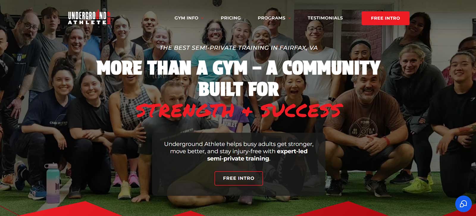
Underground Athlete serves busy adults who want to get stronger through their expert-led semi-private training approach. Their website has a lot going on visually, but they maintain cohesion through consistent brand colors and typography that keeps everything feeling intentional.
What you can learn from this fitness studio website:
Have a unique service differentiation: They clearly define their semi-private training concept right from the start, recognizing that visitors may not be familiar with this model. Having a distinct approach to fitness is important when most gyms look identical to potential members.
Layering elements creates visual interest: Multiple photos layered over each other, text overlaid on images, and graphic elements positioned over shapes create depth and movement that makes the site feel more engaging.
Strategic font pairing emphasizes key messages: They combine a bold primary font with a marker-style accent font for titles. This creates hierarchy and emphasis on important phrases and labels.
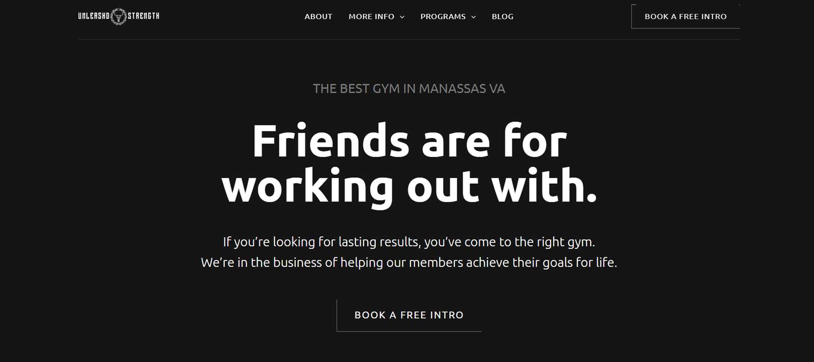
This community-focused gym creates a motivational and welcoming atmosphere for serious lifters. Their website captures the gritty vibe through dark backgrounds and serious member photos.
What you can learn from this fitness studio website:
Design that mirrors your physical space: The website's dark background aesthetic and bold images of members mid-lift perfectly capture the intense gym culture visitors can expect before they walk through the door.
Use free resources to capture leads: They offer a free grocery shopping and nutrition guide as an incentive to get people to sign up to their email list. This provides immediate value while building their contact list for future marketing.
Feature member photos: The testimonial section and group photos feature current community members and help visitors envision the culture and training alongside these people.
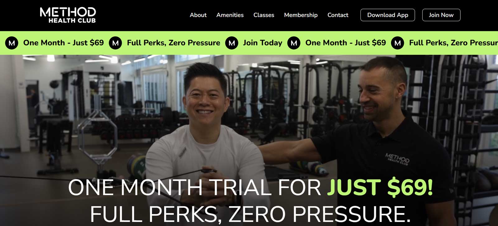
Method Health Club does a great job at presenting their comprehensive offerings through a photo-heavy approach. They also clearly communicate the benefits of joining alongside repeated trial offers.
What you can learn from this fitness studio website:
Promote any trial offers: The prominent "One Month Trial for Just $69! Full Perks, Zero Pressure” banner with clear call-to-action creates urgency and financial incentive.
Provide detailed benefits that show value: Nine specific reasons to join, each with accompanying photos and descriptive titles like "Stunning, light-filled, spa-like design," help justify their premium positioning.
Good design draws attention to what’s important: Their "Download App" and "Join Now" buttons stand out with distinctive borders. Green text and brand color highlights guide attention to the most important actions throughout the site. Interactive elements like hover effects on the reasons to join boxes provide subtle visual feedback and added emphasis.
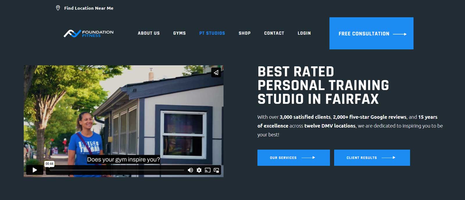
Foundation Fitness uses a straightforward homepage template approach with all the expected sections like a traditional header section layout, services, FAQs, and testimonials. While not groundbreaking, their site demonstrates that standard layouts can still work effectively.
What you can learn from this fitness studio website:
Transformation photos show real progress: An entire section dedicated to before-and-after photos of members and others holding signs showing how many pounds they lost shows evidence of real results.
Icons are uniquely tailored: Icons featuring people on bikes, barbells, scales and other exercise equipment show attention to detail. Rather than settling for generic icons, they choose one that aligns with their niche.
Interactive facility tours reduce uncertainty: The 360-degree facility view lets potential members explore the space virtually, similar to Google Street View, helping them feel more comfortable before their first visit.
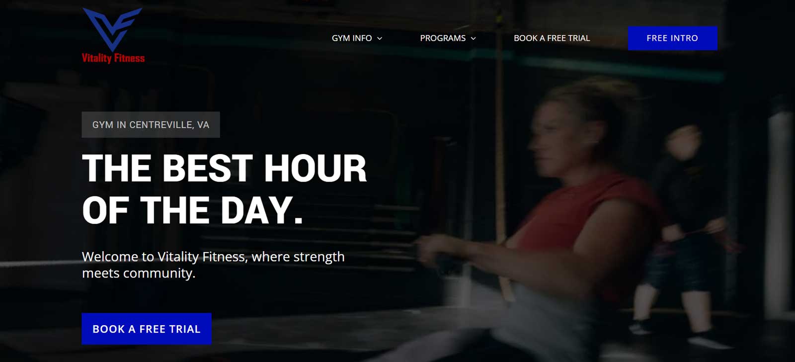
Vitality Fitness projects confidence through bold black backgrounds and large all-caps text that gives off a no-frills training atmosphere. Their direct messaging like "Get started at the best gym in Centreville, VA" reinforces their serious, results-driven approach.
What you can learn from this fitness studio website:
Acknowledge doubts and address concerns: The heading "Joining a new gym can be intimidating. But it doesn't have to be" directly acknowledges common concerns that newcomers face when searching for a new gym. It addresses those doubts by talking about their supportive community and expert coaches.
High-contrast ensures message clarity: White text on black backgrounds and dark photo overlays make key messages like "We're here to help" and "The best hour of your day" impossible to miss.
Brand color gradients create visual emphasis: Strategic use of red and blue gradients as backgrounds, accents, and highlights helps important sections stand out while maintaining brand consistency.
Final Thoughts
The fitness industry continues to grow more competitive, and studios that invest in strategic websites position themselves to attract new members. These successful Northern Virginia examples show that a fitness website doesn’t need a complex layout to be effective. What really matters is clearly communicating what makes you unique and making it easy for the right people to take the next step.
If you're a business owner looking to refine your website this year, please fill out the contact form and mention that you'd like a website review in the project description. I'll personally evaluate your site and provide a consultation with tailored feedback and a plan of action.
Get a Free Website Review
Want a second opinion? Fill out the contact form and mention you'd like a website review in the project description. I'll set up a consultation and provide actionable insights to help improve your website's performance.