Menu
Learn how three successful gym and fitness studio websites attract new members through strategic messaging, strong visuals, and compelling offers you can implement today.

The fitness industry's digital landscape is fiercely competitive, with countless gyms vying for new members. Your online presence must go beyond attractive design to create a compelling conversion path that transforms casual visitors into committed members.
In this article, we’ll dive into three fitness websites - PR Star Fitness, Underground Athlete, and Method Health Club - evaluating how well they speak to potential clients searching for solutions to their health and wellness challenges.
PR Star Fitness immediately engages website visitors with a simple yet powerful question: "What is your goal?" It’s easy in nature and designed to capture interest from the moment someone lands on their fitness center website.
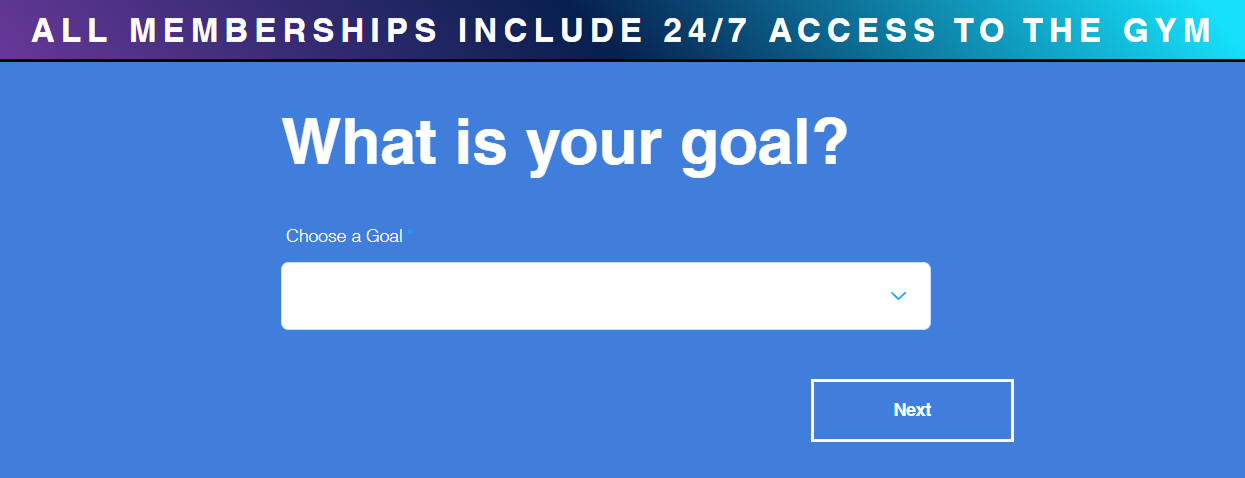
It's just one question with dropdown options, but it creates natural curiosity about what follows. Clicking Next leads to a short contact form, at which point users are already primed to finish filling it out because they’ve already taken that first small step in identifying what their fitness goal is.
When you address your visitors' fitness goals or exercise pain points right away, you demonstrate that you understand what they're searching for. This builds immediate rapport with potential gym members and increases the likelihood they'll continue engaging with your fitness website.
PR Star Fitness knows which features potential fitness club members care about most and they make these selling points prominent on their homepage.

Their 24/7 gym access is prominently featured as a key benefit, addressing a common pain point for busy professionals who can't make it to the fitness center during standard hours. Similarly, they dedicate an entire section to HYROX training, capitalizing on this trending fitness approach that's generating buzz in the workout industry.

Their facility gallery directly on the homepage is another smart move for a gym website. Rather than hiding these images on a separate page, PR Star lets visitors immediately see the training environment they'd be joining.

All 25+ photos used throughout the homepage are actual shots of their fitness equipment and gym members, not stock photography. This authenticity builds trust and gives potential members a genuine sense of the gym community they'd be joining.
By prominently featuring your most compelling gym offerings, you help visitors quickly determine if your facility meets their personal training needs.
Underground Athlete takes a storytelling approach to their website by posing a set of common fitness problems and presenting themselves as the solution. They begin by speaking directly to common workout frustrations.

By articulating these exercise pain points, they immediately resonate with visitors who are experiencing these exact fitness challenges. This emotional connection is powerful because visitors feel understood right from the start.

They smoothly transition to the solution with their headline: "Then we're ready to guide you on your journey" followed by a clear gym membership call-to-action. They further elaborate in the next section titled "That's why we've created functional fitness programs tailored to meet you where you are" which details specific personal training offerings.

There’s a testimonial section to see what other members are saying, and the story arc concludes perfectly with a "Getting started is easy" section heading that includes a contact form and an enticing offer to "Claim your free intro session and tour." This creates a complete journey from problem recognition to actionable fitness solution.
This storytelling approach creates an emotional connection that's far more compelling than simply listing gym services. By acknowledging specific workout frustrations and positioning themselves as the guide to overcoming these fitness challenges, Underground Athlete creates a narrative that potential health club members can see themselves in.
Underground Athlete understands that after presenting their fitness solution, some visitors might still be hesitant about joining their gym. That's exactly when they introduce their member testimonial section which is strategically placed to address that moment of doubt about committing.

These reviews all have a common theme and highlight the coaches and specialized training they received as the biggest draw. This strategic placement of real member transformation stories serves as that final push for visitors who are intrigued but still uncertain about joining the fitness center. It's like having a friend say, "Yes, this exercise program worked for me" just when you're wondering if you should sign up for personal training.
A lot goes into selecting the right reviews and crafting them in a visually appealing way. An effective testimonial section tells stories of transformation, builds emotional connection, and helps future customers picture their own success with you.
Method Health Club takes a different approach and leads with a compelling offer. This is immediately followed by a clear call-to-action to "Join Today."

They also have a banner running across the top of the page, ensuring it's impossible for potential fitness clients to miss. Later down the page, you see a similar banner appear again.

This also nicely strengthens brand recognition through consistent use of their distinctive green and monogram logo across their fitness website.

Method Health Club reinforces its value with nine compelling reasons to join, each paired with an authentic photo. This section expands on the value proposition after they've hooked visitors with the initial workout facility offer.
Leading with a specific, low-risk gym membership offer gives fitness-minded visitors a financial incentive to take the next step. By making the trial offer prominent and reinforcing it with solid reasons, Method Health Club makes a strong offer for joining its fitness studio.
Method Health Club has adeptly designed their navigation to highlight their most conversion-focused fitness elements. Their "Download App" and "Join Now" buttons stand out from other navigation links thanks to a distinctive outline border.

The "Download App" button also serves another subtle purpose by signaling that they're a legitimate, established fitness business with their own app. This builds credibility and perceived value for the health club.
I previously mentioned the banner promoting a special offer, but Method Health Club also uses several smaller design choices to effectively draw attention to key features.

None of these elements are particularly dramatic on their own, but together, they create a cohesive and persuasive user experience. By establishing a clear visual hierarchy and strategically emphasizing the right details, the website naturally guides visitors toward key actions and conversions.
After analyzing these effective gym and fitness studio websites, several winning strategies emerge that you can apply to your own business site. Recognize common pain points and identify with visitors’ fitness challenges. Then, structure your content like a story, presenting your business as the guide in a problem-solution narrative that helps users reach their goals. Reinforce your pitch by adding enticing offers, effective testimonials, and quality images and reasons to prove your community is thriving.
If you're a business owner looking to refine your website this year, please fill out the contact form and mention that you'd like a website review in the project description. I'll personally evaluate your site and provide a consultation with tailored feedback and a plan of action.