Menu
A look at three dance studio websites - what works, what doesn’t, and key takeaways for a better user experience.

A great dance studio website should feel as smooth as a well-rehearsed pirouette - easy to navigate, clear about class schedules, and visually in sync with the style of dance they teach, whether it's ballet, hip-hop, or contemporary.
In this review, we’re looking at the websites of three local dance studios - Adrenaline Studio, Just Dance, and Elite Formation Studio - to see how they measure up when it comes to showcasing their class offerings and overall brand vibe as well as where they might need to fine-tune their digital choreography.
The logo for Adrenaline Studio does a great job of capturing the brand’s energy with the bold, uppercase text and the green lightning bolt running through. Their choice to use a predominantly black and white color scheme with touches of this green whenever they want to call attention to an element is done well.
A recommendation is to stick to the same green hue across the site. You’ll notice that a different green is used in the logo compared to the rest of the site which uses an assortment of brighter greens. Keeping it a uniform green can better solidify the brand feel.

They do a good job of using this color in links and buttons, which naturally help those elements to stand out. By not overdoing it and keeping your primary brand color to select elements, it better connects your message to your brand.
As you scroll down the homepage, you’ll find some information about the studio, their classes, competitive dance programs, and reviews. This content is presented through numerous paragraphs, making it hard to digest because there isn’t much formatting or imagery to break it up.
There are different ways to present that information to be more engaging for visitors. Their Instagram account has over a thousand posts, and it contains lots of images that can be pulled into the homepage. Including a different image next to each of the sections for “Our Studio,” “Our Goal,” and “Our Classes” is a solid starting point.
There’s a lot of information under “Our Competitive Dance Programs.” This probably warrants it’s own separate page. They could include a short paragraph synopsis here with a learn more button taking you to that dedicated page.
Finally, the parent review section is a natural way to highlight positive experiences of other clients. In the current format, it all blends together because there’s no font distinction between the quote and the person making it.

Rather than having it all in paragraph form, using a card layout would be more attention-grabbing and easier to process. By adding a little bit of formatting and structure, you can improve the readability dramatically.
This homepage for Just Dance is a masterclass in knowing their target audience and tailoring their content to that demographic.
From the background video in the header section on down, almost every section of the homepage has photos of girls performing ballet and tap dance. Including a myriad of photos of the many students highlight how popular this dance school is.
Just Dance states that they provide classes for kids ages 3 to 13 and focus primarily on ballet/tap dance. The studio doesn’t try to branch out and teach older kids or adults. You can see from the breakdown of classes by age that the training they provide is very tailored to a specific child.

If I were a parent, I’d feel totally at ease sending my child here. You get that feeling within seconds of scrolling through the homepage. Any good business website should answer two key questions:
You can check out my list of the best dance studio websites for more inspiration.
We touched on brand colors in an earlier section but let’s revisit that. I like the concept of Just Dance’s logo - how they use a calligraphy font and weave ballerinas around the words.
The logo also includes a more compact portion featuring just the letters 'J' and 'D' inside a circle which can be used as a standalone design element if desired.
The problem with the current logo is that the pink hue doesn’t work well with white. Throughout the site, the pink labels over white backgrounds and the white text on pink buttons are hard to read and don’t meet accessibility standards.
The Web Content Accessibility Guidelines (WCAG) are international standards developed to make web content more accessible to a wider range of users, including those with disabilities. Using this contrast checker tool, you can see that it fails across the board.

Picking a set of brand colors goes beyond just the logo because those same colors will be used across a variety of elements in both digital and print. In this case, one option is to choose a darker variant of the pink. A helpful tool is this Accessible Color Generator that gives you variations of a color and background color that meet accessibility standards.
Another option is to use a dark color that’s closer to black to pair with the light pink. They have a section on their website that uses a black background, and you can see how much easier the pink label stands out compared to the white text on the pink button.

A third option is to introduce a third color - dark pink - into the brand palette and then use this primarily when paired with white. This allows them to keep the main pink but not compromise on readability.
Elite Formation Studio has great reviews and a strong following on Instagram and Facebook, but their website doesn’t quite reflect that same level of excellence. One of the biggest differences between this site and the two previously reviewed is that there isn’t a single photo of a person on the homepage, about page, or main classes page. All of the images on the site are either logos, stock photos, or promotional banners.
This isn’t necessarily a big problem if you’re a current student who’s returning to the site to check on any event or class updates. But I think this negatively impacts the credibility for prospective students who visit and don’t see any images of current students or reviews from past students. It goes back to one of the core questions I posed earlier: Can you be trusted?
Just adding a few photos from the hundreds of posts on their social media channels would quell any of these doubts on whether this is a reputable dance studio or not.
There isn’t too much content across the website, but careful thought still needs to be given as to what helpful information could be on the homepage.
There’s an about section, a donation section, contact information with location and hours, and a footer section with social media links. Placing a donation section on a homepage is unusual for any business.

Occasionally, you’ll see a website by a solo creator with a Patreon or Buy Me a Coffee option asking for donations, but I’ve looked at hundreds of websites in the recreation and leisure space and have never seen that from a business before. While this is perfectly fine to have on their site if they have generous donors, it could probably be on a separate page or at the very bottom in the footer.
For a dance studio, I would’ve liked to see more information about the classes, competition teams, and camps that they host. There are some neat promo banners on other pages and rather than hiding it behind pages under “More” in the navigation menu, it could be added to the homepage to draw more interest.

Also, depending on which of their current offerings are most popular, some of that related content would be great to include as well. Whether it’s their recreational dance classes, adult classes, or summer camps, these are absolutely relevant and should be mentioned with a link to their respective pages.
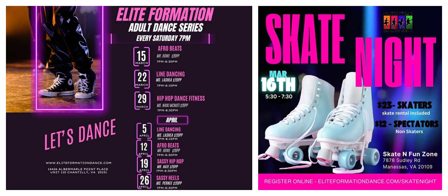
This site has promising content and would greatly benefit from showcasing it on the homepage!
A strategic website brings together thoughtful content, cohesive branding, and intentional design. When you combine clear messaging, well-matched colors, and real imagery, you create a user experience that feels both professional and personal. This reinforces the desire and trust in your service and moves people to act.
If you're a business owner looking to refine your website this year, please fill out the contact form and mention that you'd like a website review in the project description. I'll personally evaluate your site and provide a consultation with tailored feedback and a plan of action.