5 Best Escape Room Websites | Northern Virginia Edition
Analyze 5 top Northern Virginia escape room websites to learn proven strategies for atmospheric branding, user experience, and conversion optimization that any business can apply.
Tim Cheng
July 19, 2025
Creating an escape room website that captures the mystery and excitement of your business while getting them to book a visit can be challenging. With the entertainment industry becoming increasingly competitive, your website needs to drive bookings and build your brand.
By studying how other successful escape room businesses have designed their websites, you'll discover strategies for building credibility and guiding visitors towards reserving a room. Each of these 5 businesses has found strategic ways to stand out in a crowded market that you can adopt for your own website.
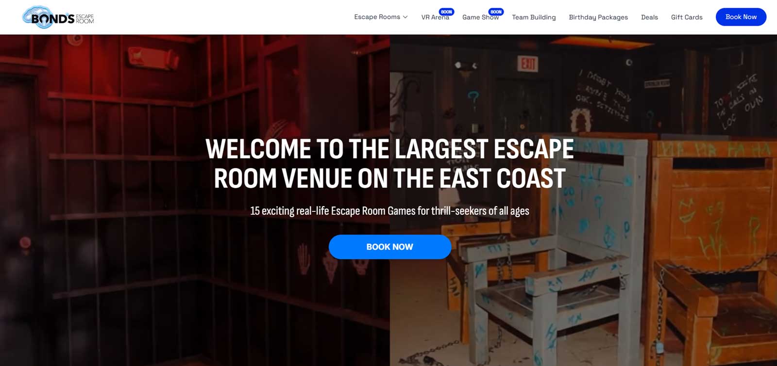
Bonds Escape Room positions itself as the largest escape room venue on the East Coast, offering over 15 games across two locations. Their homepage acts as a polished marketing site with clean, professional design that reflects an established business. It encourages deeper exploration on secondary pages and maintains strong branding throughout.
What you can learn from this escape room website:
Use numbers to establish authority: They lead with impressive statistics like "500,000 happy escapees" and "15,000 sq ft of extreme fun" to establish credibility and popularity.
Offering group packages simplifies planning: Corporate team building and birthday packages are clearly presented with specific group sizes and per-person costs. This makes it easy for different customer segments to understand their options without having to dig through multiple pages.
Guide discovery through smart content layout: Instead of overwhelming users with too much information at once, the site uses cards and visuals to guide visitors naturally and allow them to branch off to other pages for more details.
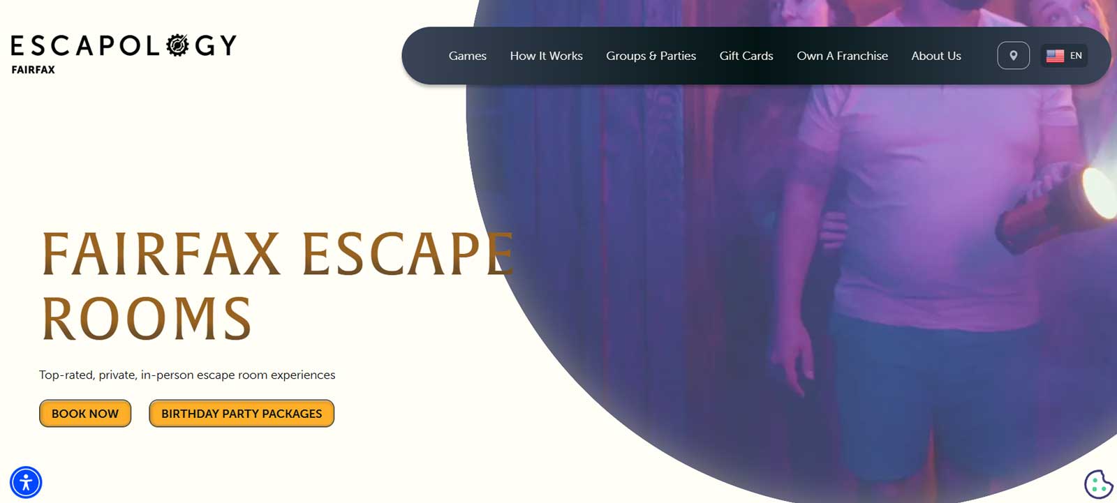
Escapology Fairfax takes a straightforward approach with distinct sections separated by different background colors and intuitive navigation. While not flashy, the website prioritizes user experience with sticky navigation and logical layout that makes finding information easy.
What you can learn from this escape room website:
Visual room showcase reduces browsing friction: All escape room games are displayed directly on the homepage with enticing photos and clear "Book Now" and "Learn More" buttons, eliminating the need for visitors to hunt through multiple pages to see their options.
A helpful guide for first-timers: A dedicated section explaining how escape rooms work is positioned strategically near the bottom of the homepage. It doesn’t get in the way of their main offerings for majority of site visitors, but it helps newcomers who might have questions.
Detailed FAQ anticipates customer concerns: Questions like "Can I leave in the middle of a game?" and "What if we need help?" address specific worries that might prevent bookings, particularly for first-time escape room participants.
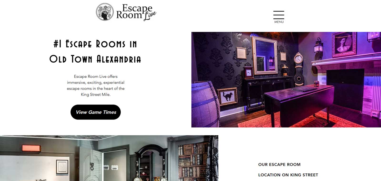
Escape Room Live keeps things simple with a no-frills approach that prioritizes clarity and ease of navigation. Despite some potential layout improvements, the website communicates their value by indicating their #1 rankings on TripAdvisor, Yelp, and Google and recognition as the top escape room in Old Town Alexandria.
What you can learn from this escape room website:
High-quality photography sells the experience: Their room photos are compelling and give visitors a genuine preview of what to expect. This instantly generates interest through visuals rather than lengthy descriptions.
Discount offerings show special consideration: Military and student discounts of 10-15% off make the experience more accessible to distinct customers while requiring only a simple phone or walk-in verification to claim.
Award badges boost perceived value: Including recognition like "Best of DC Winner" by City Paper adds third-party validation that influences visitor perception. It doesn’t matter as much who the award is from, but just having it there tends to leave a positive impression.
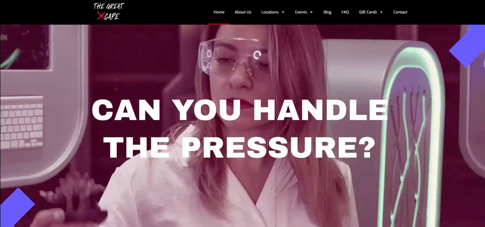
The Great Xcape uses dark and mysterious backgrounds and elements that capture the nature of escape rooms. Their website features nice visual effects including hover animations that transform photos from black and white to color, moving backgrounds, and other interactive elements that create an immersive experience.
What you can learn from this escape room website:
Professional video content elevates brand perception: A custom background video in the header adds energy and movement, giving the site a more polished feel than static images alone.
Testimonials provide social validation: Customer reviews prominently featured on the site build credibility and help visitors feel more confident about booking their experience.
Atmospheric imagery reinforces brand: Strategic use of mood-setting backgrounds like crime scene floors, red-lit dark walls, and mysterious textures creates an emotional connection. It sets visitor expectations for the actual escape room experience.
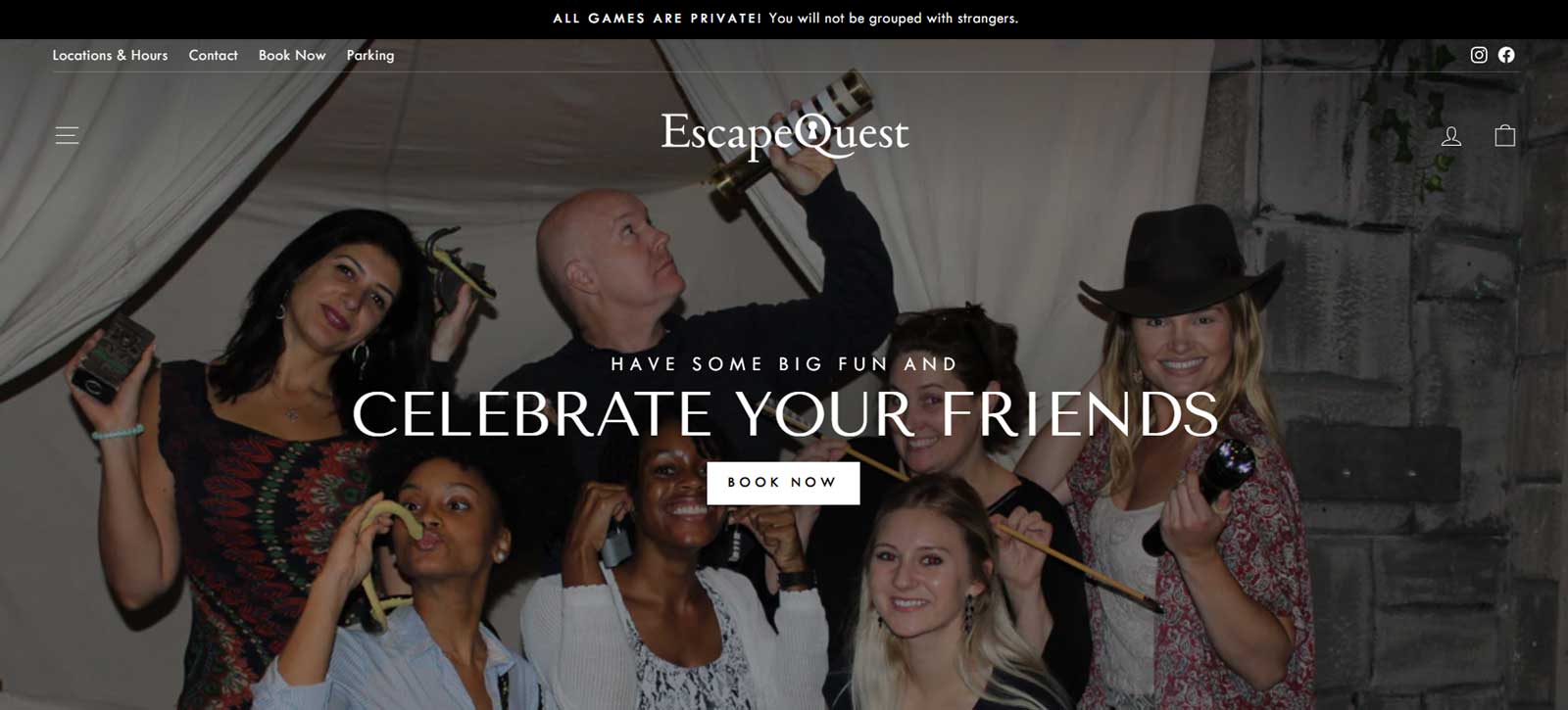
Escape Quest sets itself apart with thoughtful design choices. It uses clean layouts, plenty of breathing room, and a minimalist approach that feels intentional. Custom illustrations add a classic feel that reinforces the brand’s identity.
What you can learn from this escape room website:
Artistic visuals set you apart: Instead of standard room photos, they use conceptual artwork that resembles book covers or movie posters for each escape room. This creates a distinctive visual approach that sets them apart from competitors.
Friendly messaging that highlights social fun: Messaging like "Have some big fun and celebrate your friends" combined with header photos of friend groups emphasizes the social experience. A banner highlighting that all games are private reinforces the personalized nature.
Design consistency signals professionalism: Careful font selection, thin-line icons, and subtle drop shadows throughout the site demonstrate attention to detail that suggests the same level of care extends to their escape room experiences.
Final Thoughts
The escape room industry thrives on creating memorable experiences, and these Northern Virginia businesses understand that their websites serve as the first taste of that experience. Whether you choose bold visual effects or clean minimalism, the key is consistency in execution and a clear path to conversion that matches your brand personality.
If you're a business owner looking to refine your website this year, please fill out the contact form and mention that you'd like a website review in the project description. I'll personally evaluate your site and provide a consultation with tailored feedback and a plan of action.
Get a Free Website Review
Want a second opinion? Fill out the contact form and mention you'd like a website review in the project description. I'll set up a consultation and provide actionable insights to help improve your website's performance.